Neuron – Sales Scheduling System App
Smart Scheduling. Streamlined Desktop Productivity.

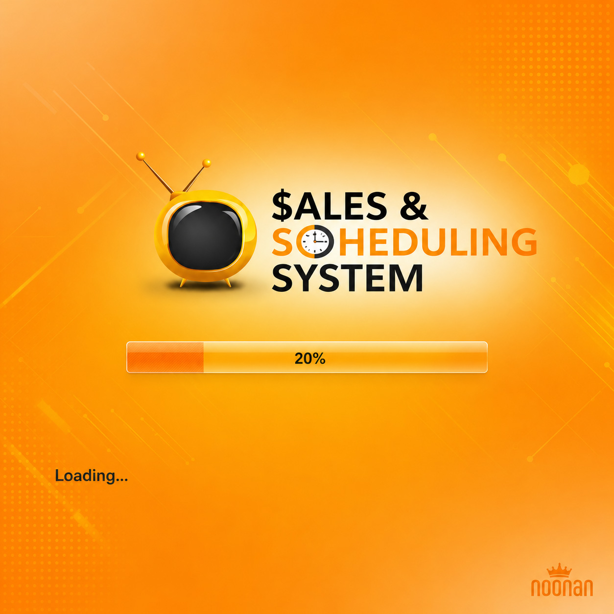
For Neuron, the goal was to create a clean, intelligent, and visually engaging desktop application identity that reflects productivity, organization, and efficient task scheduling. The branding combines bold orange and golden-yellow tones with crisp black and white accents, creating a vibrant interface that feels modern, intuitive, and highly functional for daily operational workflows.
From the signature retro-inspired application logo and loading screen experience to a fully customized desktop icon ecosystem and interface graphics, every visual component was designed to maintain a consistent and recognizable brand identity across the software environment. The result is a cohesive digital experience that balances usability with strong visual character.
Key Deliverables:
- Custom Software Logo & Brand Typography Design
- Desktop Application Splash Screen UI Design
- Branded Loading Screen & Interface Graphics
- Full Desktop Icon Set Design (32px & 16px)
- Software Utility Icons & Functional Navigation Elements
- Application Visual Identity System
- User Interface Branding & Layout Styling
- Consistent Cross-Platform Graphic Asset Creation
Brand Highlights:
- Distinctive retro-style television icon symbolizing media, visibility, and system monitoring
- Bright orange and gold palette representing energy, productivity, and workflow efficiency
- Clean bold typography designed for instant recognition across digital platforms
- Fully illustrated desktop icon suite for calendars, documents, tools, media, and utilities
- Modern interface styling with a smooth balance of playful creativity and professional usability
- Strong consistency between logo, splash screens, and application UI components
- Functional iconography optimized for desktop software environments and user navigation
Result:
A complete desktop software branding and UI asset system that positions Neuron as a smart, organized, and visually memorable productivity platform. The final identity delivers a polished digital presence with a recognizable application interface, custom icon ecosystem, and a unified visual language designed to enhance usability and strengthen brand recall across the entire software experience.
Other Work